Orange and Red on Pink
In the last few months, we’ve seen Barns-Graham’s Orange and Red on Pink 1991 screenprint popping up on bags, t-shirts and even watches! Thanks to collaborations with Tate, who hold a print from this edition in their collection, the work has been used by both Uniqlo and Swatch to produce eye-catching garments and accessories. With so much attention on this print, we wanted to take a detailed look at the composition as it developed from a 1960 painting to an experimental print, and to it’s recent reimaging by international brands.
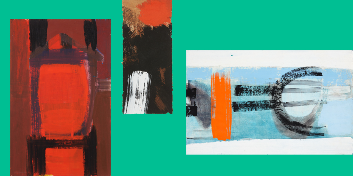
Red Figure, 1960, Black Panel with Red, 1960 and Waterspeed, 1960
A dynamic calligraphy
Orange and Red on Pink was first painted in gouache in 1960 as part of a series of works first shown at the Scottish Gallery in 1960 in the exhibition, W. Barns-Graham: recent gouaches and Spanish drawings. Created following a trip to Spain and the Balearic Islands in 1958, this series of expressive abstract paintings in hot tones of gouache and lively rock studies was extremely successful. Out of the 71 works shown, only 15 or so remained unsold at the time of the artist’s death.
In his introduction to the exhibition catalogue, Alan Bowness, art critic and later Tate Director, writes of the series:
We have begun to talk about the calligraphy of the picture, and calligraphy literally means beautiful writing. It is this dynamic calligraphy and new sense of scale that distinguish W. Barns-Graham’s recent paintings. They are as big as oils to which most of us are accustomed, but the medium used with ease and dexterity is in fact gouache – a medium that we usually associate with paintings of very modest dimensions… Nobody has explored its possibilities with such impressive results as Miss Barns-Graham.
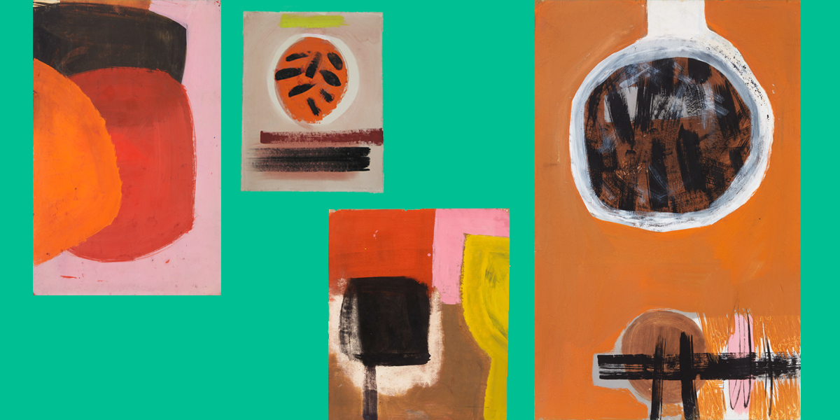
Unfinished and completed works from the Spanish Gouache series
Terra rossa and Plaza del Toros?
As can be seen in this selection of finished and unfinished works, Orange and Red on Pink brings together two distinctive characteristics of the Spanish Gouache series: the colour palette of scorching red, oranges and pinks, perhaps inspired by the Terra rossa of Mediterranean; and a cluster of thick black staccato lines. In Orange and Red on Pink, these lines, usually enclosed by a circle (I interpret them as darting bull in the Plaza del Toros but my colleagues disagree), push beyond the confines of their orange boundary and dash into the red. Here, too, colours themselves are allowed to retain the vibrant punchiness of pure pigments and not muted with browner tones as is often the case with the series.
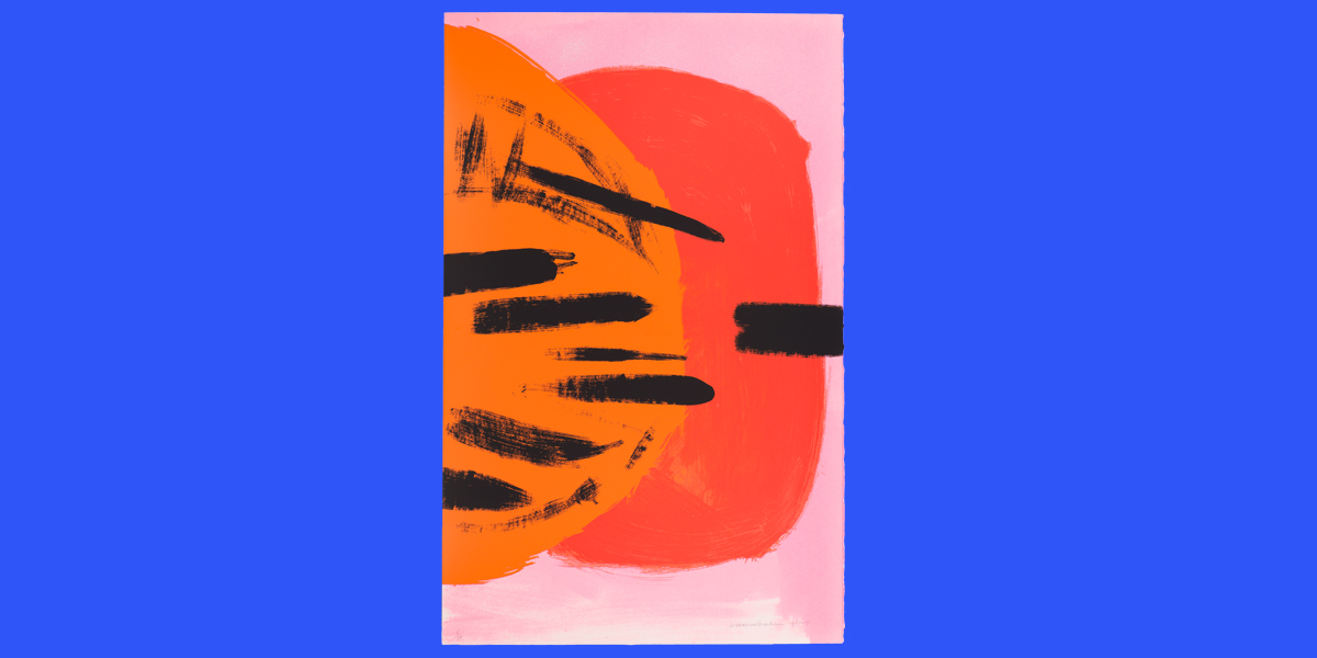
Orange and Red on Pink, 1991, screenprint, edition of 70
A change of scale
In 1991, Barns-Graham met master printmaker, Kip Gresham, then working at Curwen Studio, through friends Rose and Nelson Rands. Following their meeting, they developed an initial plan to reproduce three paintings using lithography and screenprinting. The first of these to go into production was Orange and Red on Pink.
The irony of the scale of the gouaches that so impressed Alan Bowness is that when it came to reproducing Orange and Red on Pink as a screenprint, Kip Gresham chose to reduce its size by around 15% from its original dimensions of 91.5 x 58.5 cm to 76.3 x 48.8 cm for the print. Gresham writes of this contraction:
We are very pleased with it and feel it has the colour balance between the Red-orange and Red-pink which is critical in the original. The change of scale seems to concentrate the image rather than reduce its power.
Letter from Kip Gresham to Barns-Graham dated 9 September 1991
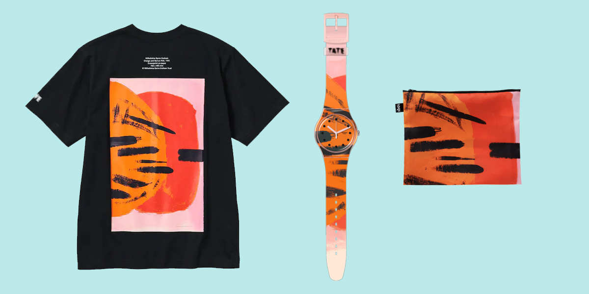
Uniqlo tshirt, Swatch watch and Tate pouch featuring Orange and Red on Pink.
Ultimately, Barns-Graham found the transformation from painting to print a little unsatisfactory. She reflected there was perhaps more potential in exploring printmaking techniques to realise new ideas, rather than reproduce those already executed in other mediums. In January 1992, she wrote to Stanley Jones, Director of Curwen Studio that she felt ‘guilty having used your time in production of one of my gouaches when I realise I could have used the time in learning from you something about lithography’.
What would Barns-Graham have thought about the recent manifestations of Orange and Red on Pink? As someone who readily embraced new media and the possibilities it could bring, she probably would have revelled in it. Although I suspect she would have preferred to design something original for both Uniqlo and Swatch.
This article takes reference from Ann Gunn’s 2007 book The Prints of Wilhelmina Barns-Graham: a complete catalogue.